Turning operations into insights.
Designed and prototyped an operations dashboard for a modular footwear brand — inventory, orders, customers, content and analytics in one place.

Overview
The 30-second version.
Svaroots is a conceptual modular sneaker brand, a base shoe plus swappable patches in regional Indian textiles. Five product types with five different stock logics would break a generic Shopify backend, so I designed its operations dashboard: seven screens that let a small D2C team run inventory, orders, customers, content, and analytics from one place.
What is Svaroots?
A conceptual modular footwear brand built around interchangeable components, regional Indian textiles, and post-purchase ownership.
Svaroots reimagines the sneaker as a system — a base shoe paired with swappable patches crafted in regional Indian textiles like Kalamkari, Ajrak, Paithani, Bandhani, and Ikat. Buyers don't just purchase a product; they enter an evolving relationship with it.
The entire dashboard, end to end.
I led research, information architecture, the design system, UI, and every interaction state across all seven screens.
Brand, product, & consumer surface.
The team worked together on the logo, the brand identity, the concept, and the consumer website.
The product the team built.
Quick context on Svaroots and the collaborative work that set the stage for the dashboard.
Brand Logo
A patch-shaped mark built around a spiral — a sign for self-identity.

The product
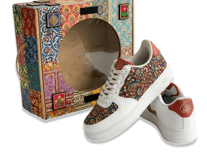
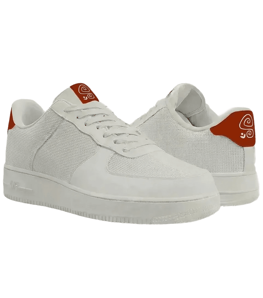
Base sneaker for Indian feet. Three modular zones accepting Kalamkari, Ajrak, Paithani, Bandhani patches.
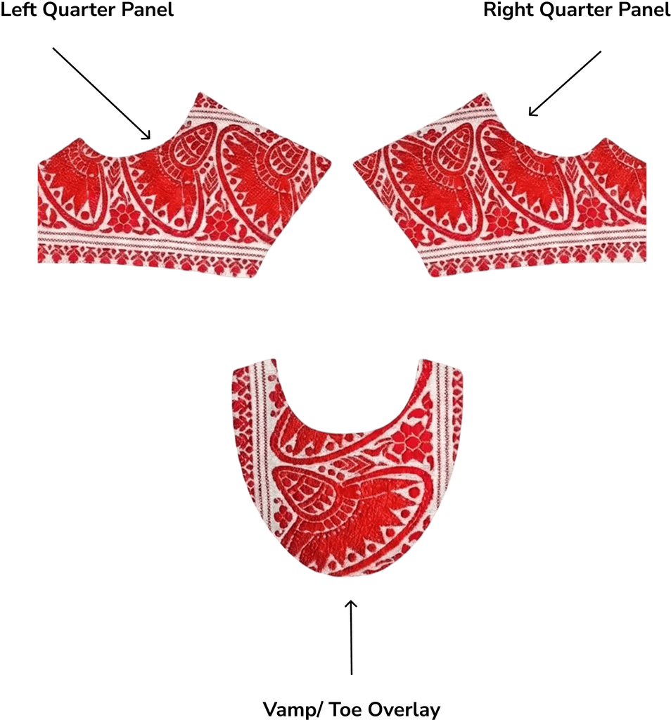

Packaging
Modular packaging system for sneakers, patches, and gifting kits. Designed to reflect the brand's textile heritage.
 Featured on Packaging of the World


Consumer storefront
Home, 3D Lab, and Community. Where the buyer becomes a co-creator.
Once a customer hits "order", everything I designed kicks in.
Designing the operational layer.
Svaroots isn't a running business, so nothing here grew over time — the complexity is baked into the product model from day one. A base shoe plus swappable patches means five product types with five different stock logics, and once you model that honestly, a generic store backend stops being able to answer the questions an operator would have to ask daily. That gap is what this dashboard was built for.
Svaroots is a concept, so every number on this dashboard is modeled — built from the brand's pricing and public D2C benchmarks, not live orders. Real data would change the values, not the structure. Which metrics exist, and how they connect, is the design work.
A modular shoe needs custom ops.
Svaroots sells a base sneaker plus swappable patches in regional Indian textiles. Five product types, each with its own lifecycle. If it launched today, a modular brand like Svaroots would be running on spreadsheets and a generic Shopify backend.
Detailed market analysis, reversible modular patch mechanisms (avoiding Velcro), and unit economics are documented in the Business & Concept Research Document ↗.
The ops team is flying blind.
Shopify is great for running an online store, but its default inventory dashboard isn't built for sneaker brands. It doesn't surface insights like size-wise inventory, dead stock, patch-to-sneaker sales, or which sizes need restocking first. As a result, the team spends time piecing together information instead of making quick inventory decisions.
Seven screens, one operations hub.
A custom dashboard that gives each product category its own view, surfaces the metrics only a modular brand needs, and lets a small ops team manage inventory, orders, users, content, and analytics without switching tools — with role-scoped access for every member.
The storefront is where the magic happens. The dashboard is where it keeps happening.
Design POV
Meet the operator behind the counter.
A composite of how small D2C ops teams actually run their day. Every screen in the dashboard exists to answer one of their questions.

Rahul
Ops Admin · Svaroots
The one person responsible for orders going out on time, stock staying healthy, and the team knowing what's true. Today that job would live across a Shopify admin, spreadsheets, and WhatsApp threads.
Not just Rahul: content editors, support, and an analyst work in the same dashboard — with role-scoped access set up in Settings.
- Ship every order on time — and know instantly when one is stuck
- See stock health per size before a size-run becomes a fire
- Prove which drops made money — campaign impact, not gut feel
- Give the team access without giving everyone everything
- Data lives in five tools, and none of them agree
- Generic dashboards have no answer to patch-to-sneaker questions
- The day is firefighting — problems surface after they've cost money
A day in the loop
One operating day, mapped to the seven screens
The morning glance
How did we do overnight? Revenue, orders, and traffic health before the first chai.
Clearing the queue
New orders move through their lifecycle; stuck ones get flagged, the CSV goes to logistics.
Stock triage
Size-run health and bundle readiness decide today's restock calls before anything sells out.
Customer signals
At-risk regulars and member economics shape this week's retention nudges.
Storefront updates
Banners, drops, and artisan stories go live without touching code.
The week in data
Patch attach rate and returns by reason tell the team what actually worked.
Behind the system.
An operator arrives with a product question, not a status question. So product categories became the spine, order status became tabs inside one screen, and everything else hangs off that decision.
What is happening right now?
- KPI row
- Customers
- Traffic Sources
- Recent Orders
Where is each order?
- Lifecycle tabs
- Order detail
- Delivery addresses
- Export CSV
What can we actually ship?
- Bundle Readiness
- SKU Inventory
- Stock Breakdown
- Size Run Health
- Manage Dead Stock
Who are our customers?
- Customer Segmentation
- Purchase Frequency
- Member AOV
- User Directory
What is the storefront showing?
- Products
- Banners
- Campaigns & Drops
- Stories
- Website Settings
What does it all mean?
- Revenue by Category
- Sales Performance
- Top Products
- Returns Overview
- Operational Insights
Who can do what?
- Team & Roles
- Role Permissions
- Brand Account
- Billing
- Activity Log
Sketches before pixels.
Low-fi paper wireframes used to test flow and hierarchy before any pixels were pushed.
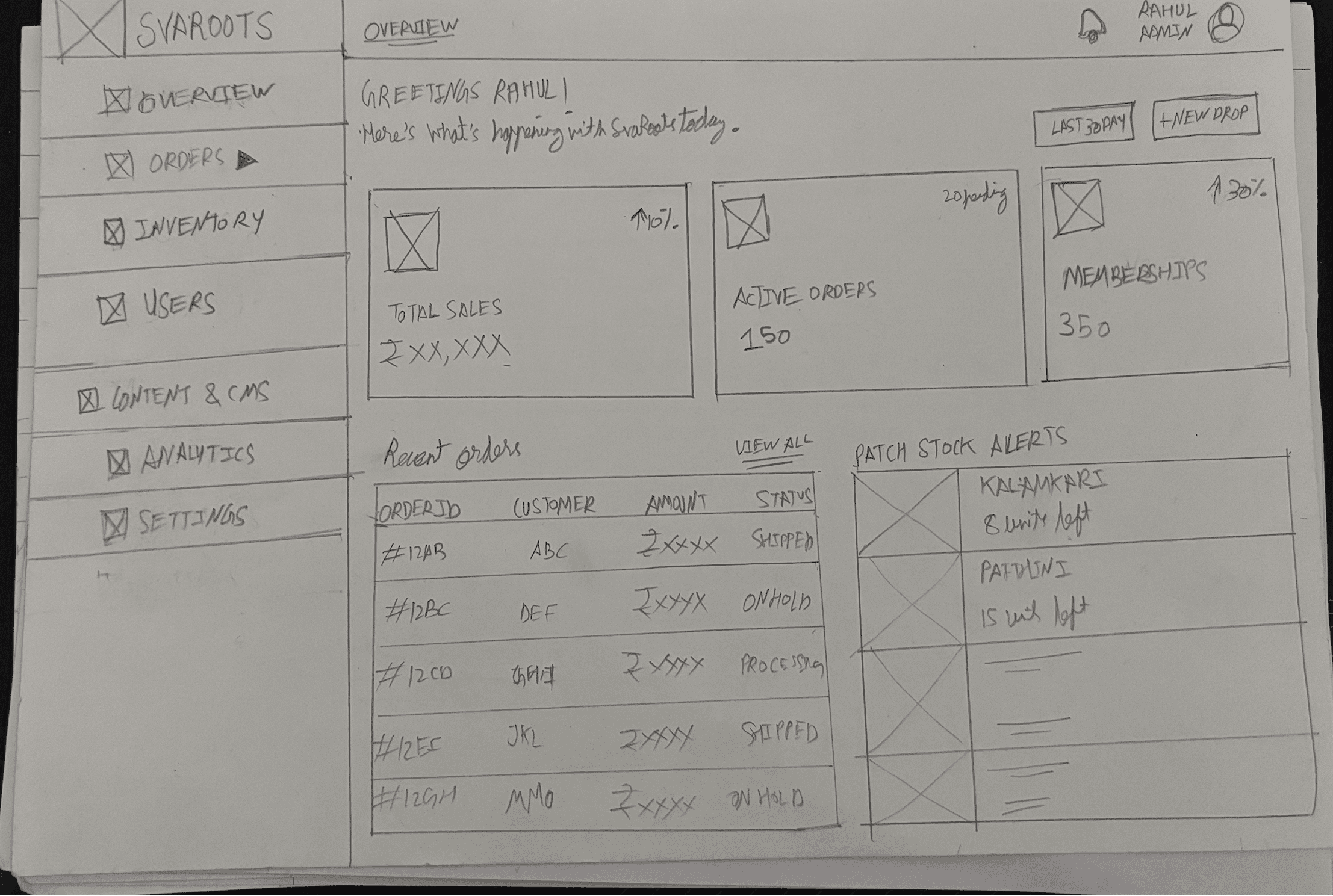
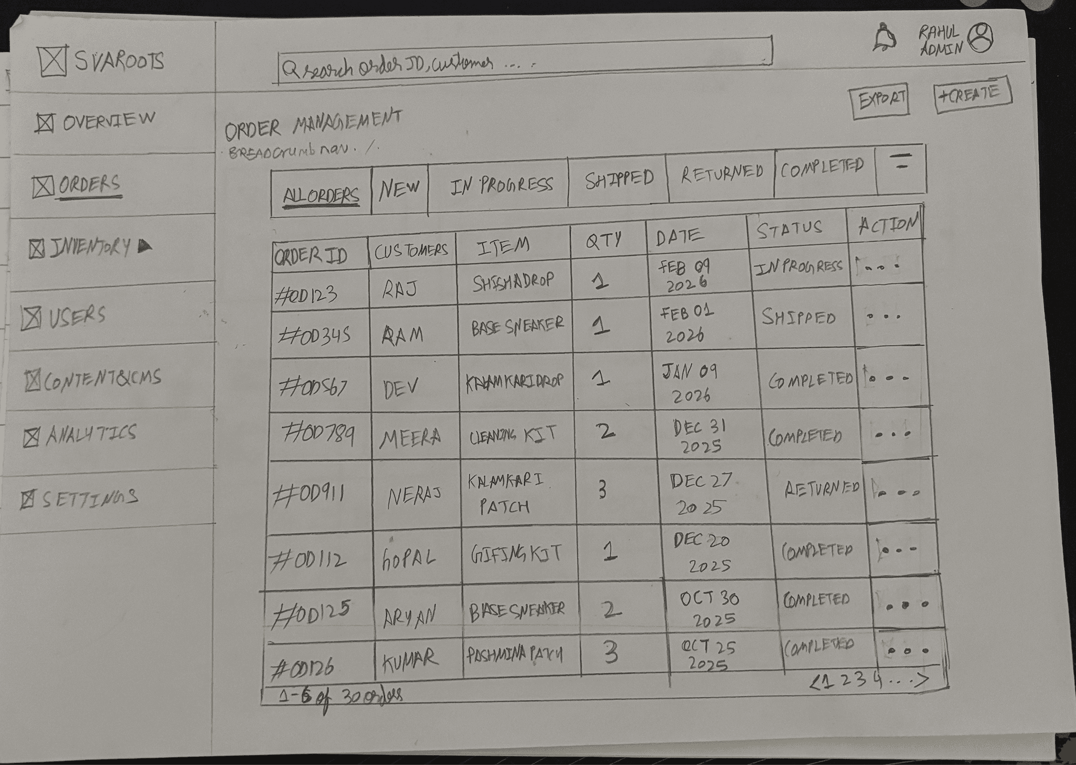
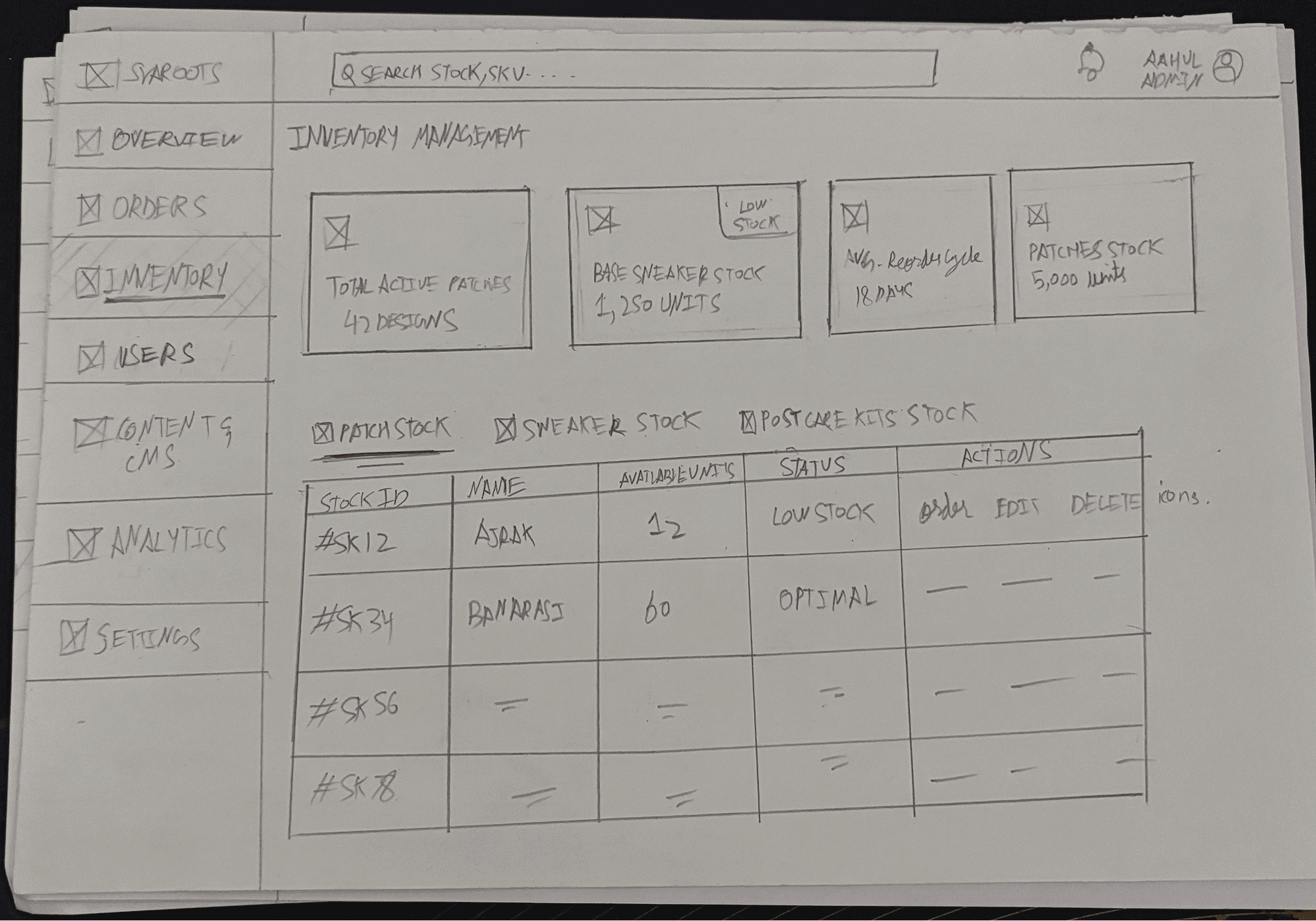
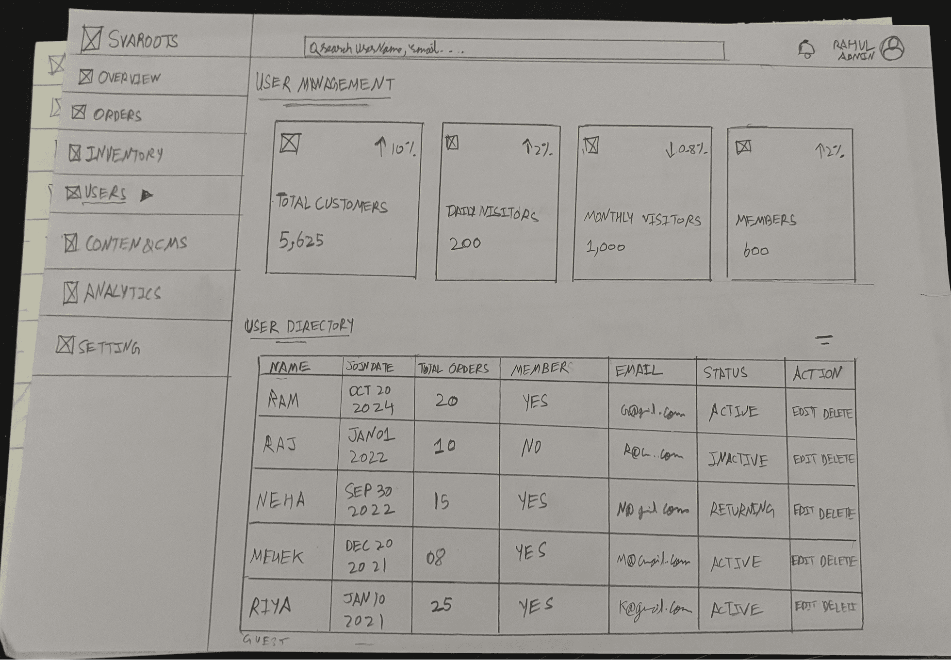
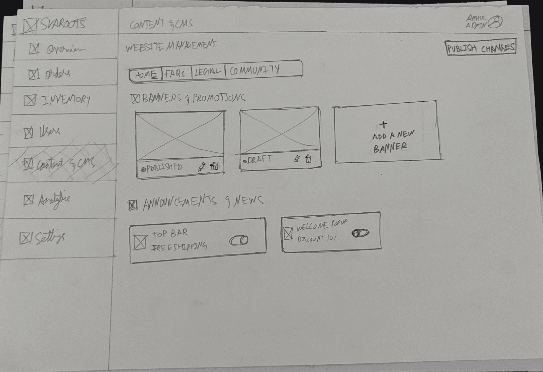
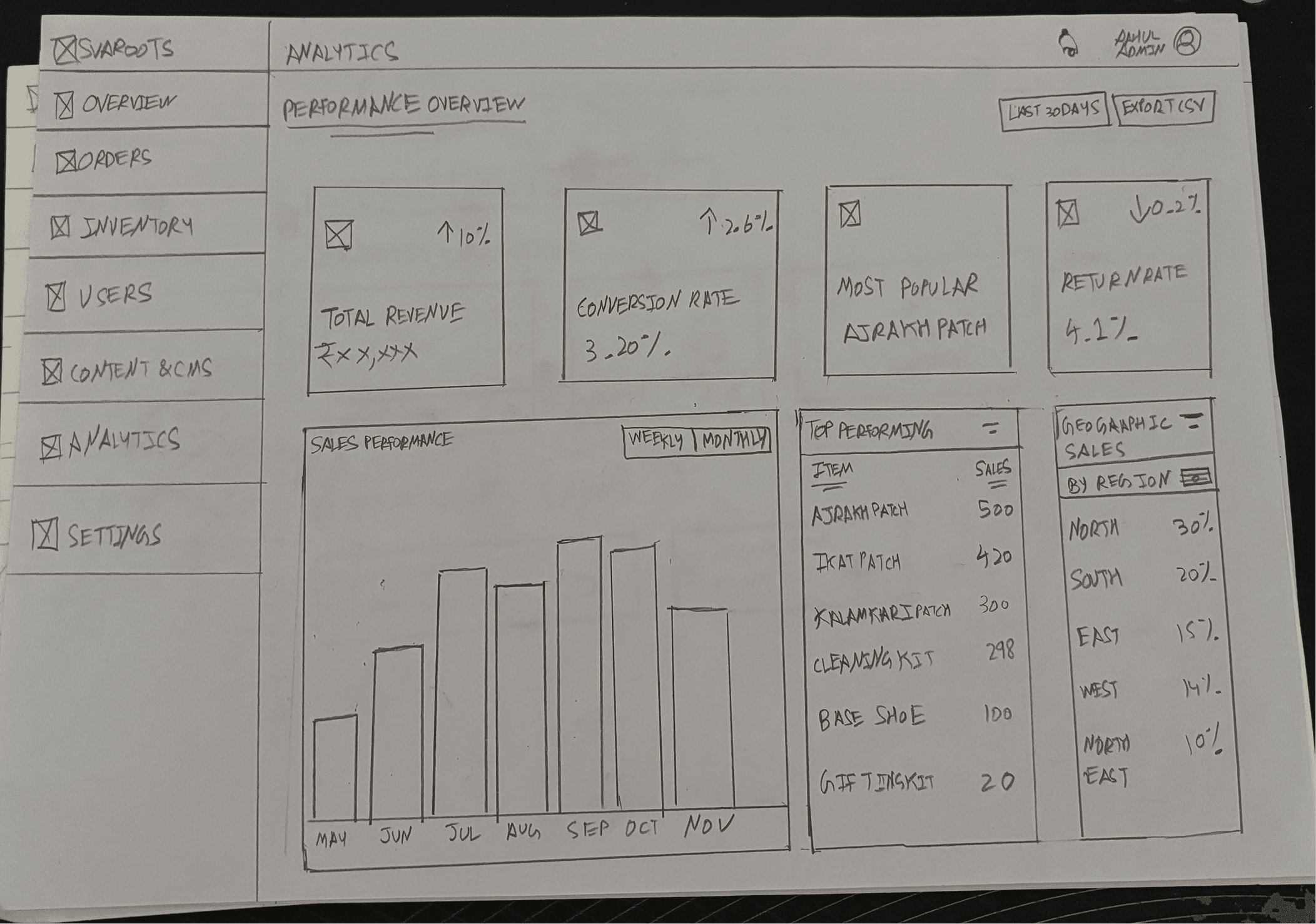
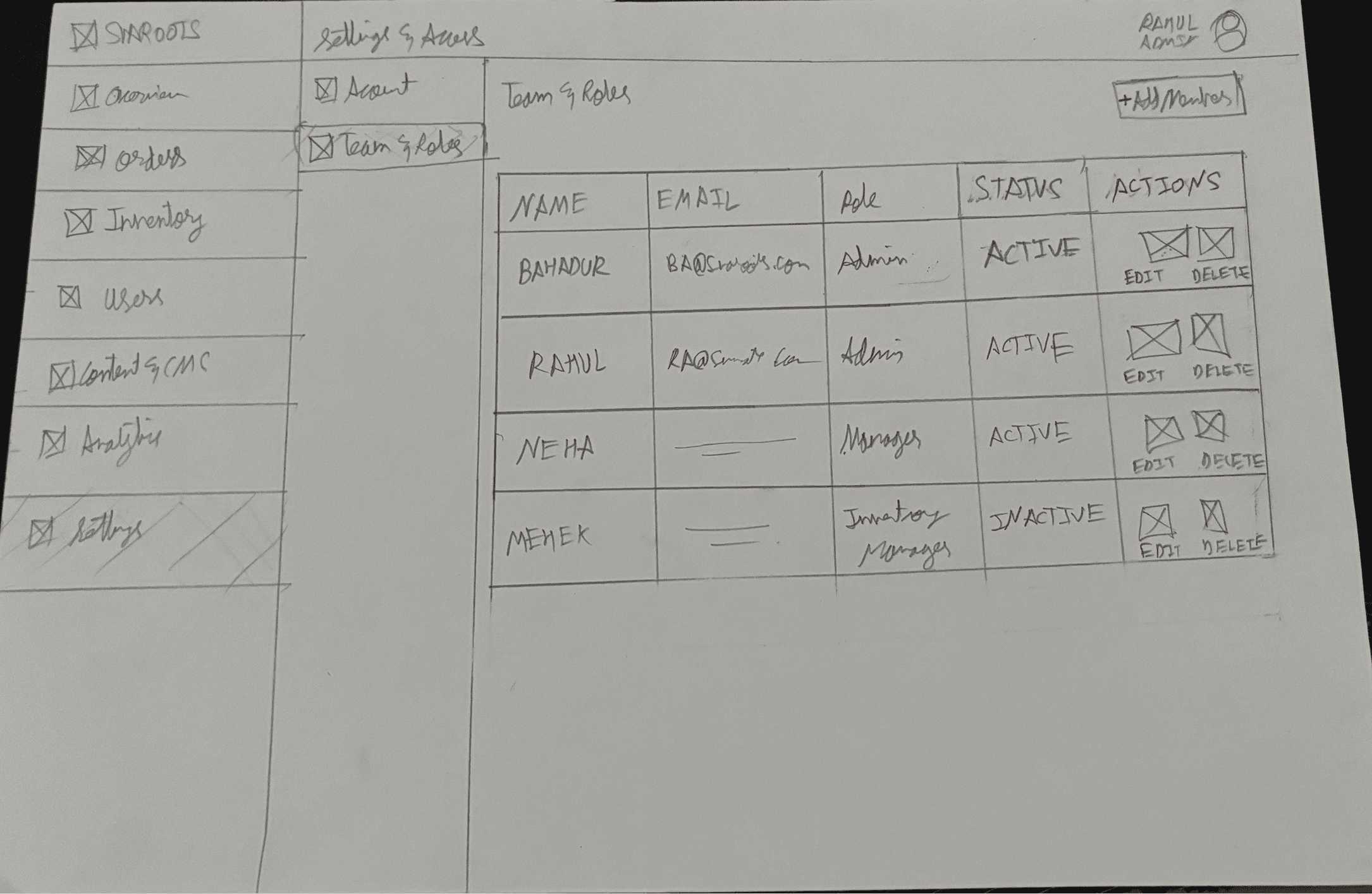
What the paper said: one early layout ran all five product types through a single filtered table. Walking the flow on paper showed that filtering isn't seeing — the category-tab structure in Chapter 08 came out of that dead end.
Five screens that complete the loop.
Overview for the morning glance, Orders for fulfilment, Users for lifecycle, Content & CMS for storefront control, Settings for governance — roles, billing, and a full activity log.
The morning glance
One screen that answers "how are we doing today?" before the first chai.
- KPI row — revenue, orders, and conversion health at a glance
- Customer split — new vs returning buyers
- Traffic sources — where today's visitors came from
- Regional insights — which states are buying
Inventory is not one list.
Five product types, five different stock logics. Shopify models all five as one flat SKU list — and my first paper layout copied that mistake: one table, filters on top. Walking the flow showed that filtering isn't seeing.
Five product types sharing one screen.
Patches sell fast with low/moderate alerts. Sneakers move slower but need size granularity. Drops are time-limited. A single table would bury the differences.
- Bundle Readiness. Can this order actually ship? One sneaker plus one patch equals one shippable bundle, broken down per size.
- Category tabs. Which stock logic am I looking at? Patches, Drops, Sneakers, Cleaning Kit, Gifting Kit — each tab shows only what matters for that type.
- Size Run Health. Which size dies first? Sold, available and reserved per Indian size, with an alert before a run goes empty.
- Dead Stock. Why is this sitting here? Every slow-moving SKU carries a reason — wrong size mix, old drop season, high return rate — so the next action is obvious.
- Inventory Runway. How long do we have? How long current stock lasts at the current sell rate — the first number an operator checks.
Inventory — category tabs, bundle readiness, Size Run Health, dead stock
Each product type answers a different stock question. One flat list can only answer one of them.
Sell in weeks, and are worthless without the sneaker they clip onto.
Fast · dependentMove slowly, but every decision is per size, not per SKU.
Slow · size-levelTime-limited. The value dies when the window closes.
ExpiringSteady consumable. Low attention, reorder on a threshold.
SteadyA bundle — its stock depends on everything inside it.
CompositeThat is why Inventory is tabbed rather than filtered: each tab shows only the fields that product type actually has.
Most of this is standard. One number isn't.
Svaroots needed to know how patches and sneakers move together, which categories actually earn, and why stock comes back.
One metric no store dashboard reports.
Four of the five metrics here exist in any store dashboard. They matter because a category is a product **type** in a modular catalogue, so the same chart answers a different question. The fifth doesn't exist off the shelf at all.
- Patch Attach Rate. Is the modular model working? How many patches sell per base sneaker — 2.4 today, and the only number here no off-the-shelf tool reports.
- Revenue by Category. Which product type is the engine? Patches alone account for 42% of revenue.
- Returns Overview. Why does stock come back? Returns by reason, with size mismatch at 48%, feeding straight into size-run planning.
- Top Performing Products. What earns its shelf space? Ranked across all five product types, not just sneakers.
- Operational Insights. So what do I do now? The prompts that follow the numbers — prioritise restock, promote bundles, plan the next drop.
Analytics — revenue by category, patch attach rate, top products, operational insights
A system built for density.
The dashboard runs on a custom design system built in Figma with tokens, components, and charts, all bound to Variables.
Typography, color tokens, spacing, components.
Click through all seven screens.
The full operator flow, clickable in your browser — every sidebar link works. Built with Claude, hosted on Vercel.
What this project expanded.
Designing the dashboard pushed Svaroots beyond the storefront into the operational systems behind modular commerce — and it taught me how operational visibility shapes a product experience. Honest limits: this is a concept. The data is modeled and no ops team has run it yet. My next step is validation — a morning-triage walkthrough of the Overview with small D2C store operators, and a comprehension test of the Bundle Readiness table without me explaining it.
The product model shapes the IA.
Patches, sneakers, drops, kits. Once I stopped treating them as "products" and gave each a dedicated tab, the inventory screen stopped feeling like a spreadsheet.
Invent the metrics the business needs.
Patch-to-sneaker ratio and customisation rate do not exist in Shopify. If the business model is new, the dashboard metrics have to be new too.
Seven screens is a system, not seven pages.
Shared components, shared tokens, shared table patterns. The design system is what makes seven screens feel like one product.